


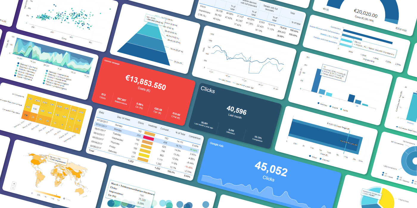
Having the right numbers is always important, but visualizing them in the right way can make an even bigger impact. That’s why we have highlighted 20 chart types you can use to demonstrate your key success metrics.
These days, there are data visualization examples everywhere: from printed ads through TV news shows to social media videos. Consumers and business people alike have become sophisticated recipients and users of information – it’s not just marketers anymore. Many media outlets and businesses are using data insights to make website content and corporate presentations more compelling, by using rich visualizations and vivid graphical elements.
Driving this trend is the constantly increasing volume and variety of customer- and business-related data, generated by numerous sources. The abundance of information is helping marketers and businesses to become more data-centric and data-driven, to understand their customers better and provide them with an improved experience.
There are numerous chart types you could use to visualize KPIs; plus, design elements in most data visualization and business intelligence tools are now slicker, simpler and more impactful than ever before. Marketing professionals can now tell simple and effective stories by drawing attention to specific trends and data points extracted from the mountains of data at their disposal.
Organizing and combining previously siloed data and displaying it in rich dashboards allows marketers to monitor all of their KPIs more closely, and base their decisions and actions on quality information. Optimizing campaigns by learning from data has never been easier, but with this variety of options it is sometimes hard to decide which type of visualization can you use to display different types of information.
With this in mind, we have highlighted 20 types of charts you can use to visualize your data in an effective and impactful way.
Geometric shapes
A Pie Chart is a visually-attractive and highly effective way of displaying data in a simple manner, especially if you use bright block colors and a simple and clear key. This makes it ideal for showing information about proportional data, such as website visitors by device type or a spread between social platforms, so practically in all cases where the distribution covers a limited number of categories.
However, if you want to use your marketing dashboards to analyze more in depth data in specific pie chart slices, then a Pie Chart with drill-down sections can help to give your decision-makers more detailed information, such as click-throughs for specific products or brands.

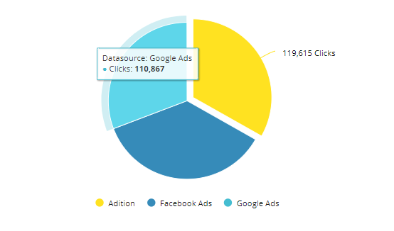
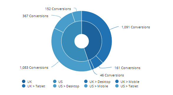
A variation on the Pie Chart is the Donut Chart, which is a stylized and appealing way of displaying up to a dozen or so different sectors, such as a split of ad platforms in your media plan. The great thing about a Donut Chart is that you can include an inner concentric circle, which can represent larger subsets of data and encompass several of the outer sections.
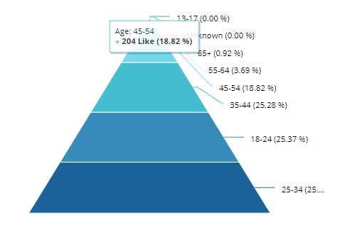
Another simple and clear geometric shape is the Pyramid Chart, which is perfect for visualizing quartiles in colored layers, to illustrate demographics information such as social media Likes per age group, or for displaying data bits that have a clear hierarchical order.
Text-based Charts
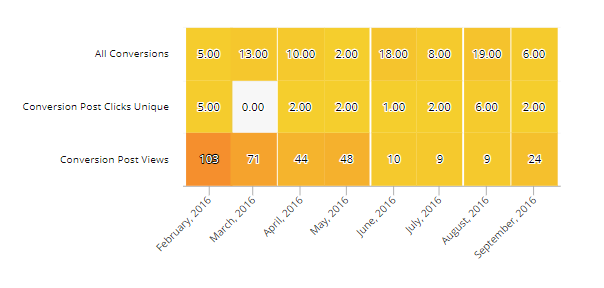
You can enhance these traditional Data Tables by using color heatmap tabs or labels, to highlight different regions, demographics, seasons, time-series and so on. As with the geometric shape charts, the aim is to bring clarity through data visualization.
Data Points
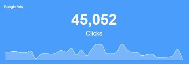
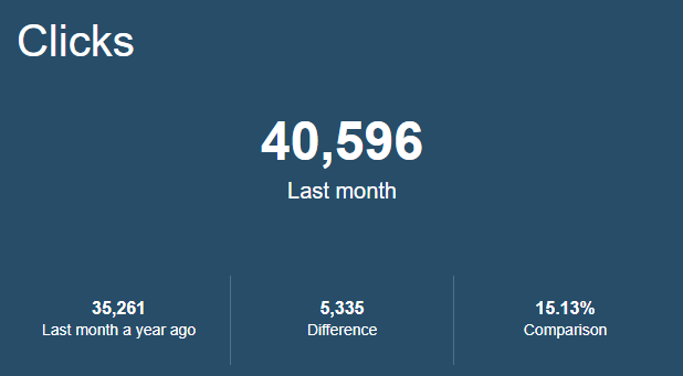
If you need to highlight one particular KPI data point, you could use a chart that displays a single figure. With this you can visualize total spend for a marketing campaign, for example, or perhaps total clicks during a certain time period.
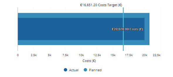
Alternatively, a chart that showcases two or more different data points can compare current KPIs with figures in previous periods or indicate actual versus planned results with the difference as the third figure. This provides a context to the displayed data, very much needed for decision-makers that are not in constant contact with this type of data.
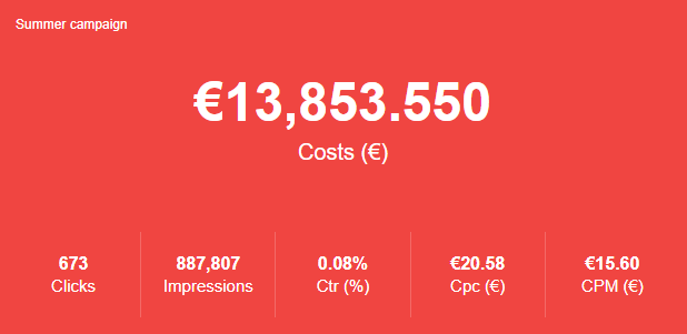
This type of no-nonsense chart doesn’t just have to show only single figures though. You can use it to display a series of KPI boxes with multiple metrics or show the same KPI but on different days, with the average or total displayed in a larger font to draw attention to it.
Bar and Line Charts
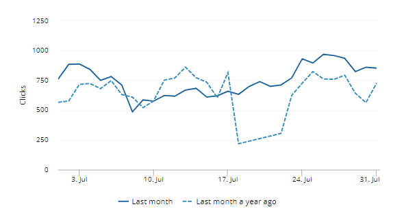
As with the traditional Information Table, there’s no beating a horizontal two-axis Linear Bar Chart when it comes to visualizing multiple complex data points over time on your marketing dashboards. For example, for website traffic, it’s best to display it in a linear chart, plotting data points over time, and potentially showing a comparison with the previous period in a different bar color or style.
Or, you can use a Vertical Bar Chart to clearly compare products, brands or competitors side-by-side. The use of color or textured bars can help marketers and other decision-makers to quickly comprehend the information and act based on the insights.
In place of a set of bars, the Line Chart offers greater versatility in drawing attention to trends over time, such as spending patterns, viewing engagement, and so on.
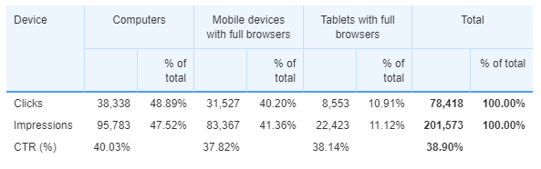
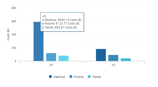
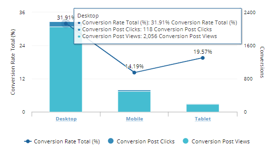
Something that works with both a horizontal and vertical graphic is the Grouped Bar Chart, which can be used for KPI reporting that relates to several different categories. For example, you can use it to track website visitors or ad impressions by device: for computers, mobiles, and tablets.
Lastly, on the subject of Bar and Line Charts, an attractive alternative is the Bullet Graph, which is akin to a traditional thermometer chart or progress bar, and can be used to visualize a full range of KPIs, especially the ones that require constant monitoring, such as ad performance or budget spend.

Graphical Charts
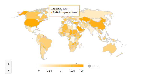
As well as all of the charts outlined above, marketers can count on more stunning data visualization methods that can transform your marketing dashboards. For example, a two-dimensional Geo Map can be color-coded by region, and can show, for example, ad or sales performance by country.
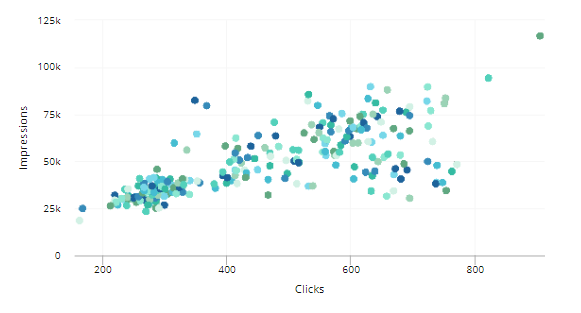
Or you can use an attractive Scatter Plot Graph to look for correlations between data sets - such as plotting clicks against impressions. Remember to use color for the bets results.
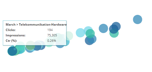
Bare Bone Bubble Chart offers an even more dramatic way of highlighting trends through the use of colored circles. You can choose a specific metric, such as clicks, to arrange your data in ascending order, but reveal other KPIs, like impressions and CTR% for each bubble, when you hover over them.
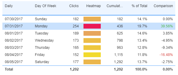
Then there’s the Calendar Heatmap, a neat and defined way of presenting date-related KPIs, using cool-to-hot ‘heat map’ shades to demonstrate lower-to-higher data figures respectively.
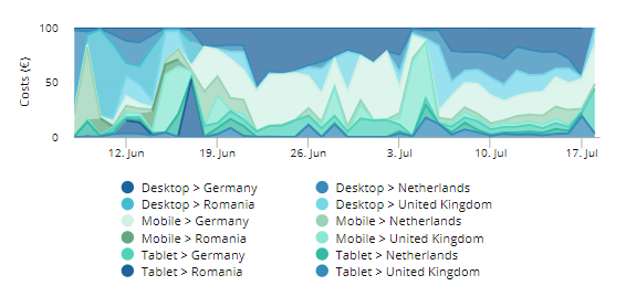
The Stacked Area Chart can also be used to display complex data, using dark and light shades and colors to compare complex data points over time.
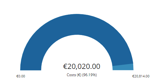
Finally, the Gauge Chart offers a clear and effective way of illustrating a simple KPI that starts at zero and goes up to a particular figure. With it, you can help people to focus their attention on a cost figure, for example, and see where the business actually is, compared with its projections.
Good charts need good data
There are a huge number of data visualization charts and graphs to choose from when it comes to creating great-looking, but also effective and insightful, marketing dashboards, using data consolidated from various marketing platforms. And by making your KPI reporting more effective, you will help your business decision-makers to monitor key indicators more easily, and reach better outcomes.
However, it should go without saying that in order to create genuinely impactful, insight-generating dashboards, you need quality accurate data that is, more often than not, integrated from multiple sources. Otherwise, no matter how beautiful your graphs look - they just won't be helpful or, worse, will mislead you.


