


Dashboard creation is not always easy and the wrong choices can mean the difference between powerful insights for your business and a forgotten tool nobody uses. In this blog post, Adverity’s Andy Fairclough runs through his 4 golden rules for dashboard best practice to help you avoid the more common pitfalls.
“There is a magic in graphs. The profile of a curve reveals in a flash a whole situation — the life history of an epidemic, a panic, or an era of prosperity. The curve informs the mind, awakens the imagination, convinces.” - Henry D. Hubbard (1870-1943)
Designed correctly, dashboards can be a powerful tool that inspire users and draw out important, otherwise unseen, insights. However, all too often dashboards are created with all the fanfare and excitement before being left by the wayside unused, unloved, and eventually gathering dust somewhere. Although this is not always the fault of the dashboard, in many cases, the issue could be avoided by taking a more strategic approach to dashboard creation right from the start.
Here we present our 4 golden rules for dashboard best practice to help you create strategically designed dashboards that tell a story with your data and inspire insight-driven actions from its users.
1. Have a strategy
First things first, ask yourself what is the goal of this dashboard? What are you trying to achieve and how will it be used? For instance, dashboards can be used for business reporting, tracking marketing performance, monitoring media campaigns… the list is pretty endless. But, once you have answered this question, it will help determine the overall structure.
Next, think about who it is for. Which departments will use the dashboard? Which stakeholders need to see what information? Most importantly, what level of data maturity does the audience have? Again, answering these questions right at the start will help determine the best way to approach it.
The more senior or more general the audience, the higher level the information on that page should be, e.g. KPI focused, sales, reach. These are strategic pages. Conversely, the more specific the audience (e.g. a paid social department), the more specific the information on the page e.g. social CPM, engagements. These are tactical pages.
Lastly, determine the specific KPIs and metrics that will populate this dashboard. It’s important at this stage to avoid headless chicken marketing and not think about siloed KPIs specific only to each department, but how they can be aligned with and complement the overall goals and aims of the business at large. For example, having a KPI related to conversions is great - but how does that fulfill larger goals for the organization and relate to other department goals?
2. Tell a story
“Most of us need to listen to the music to understand how beautiful it is. But often that’s how we present statistics: we just show the notes, we don’t play the music.” - Hans Rosling
At its core, data is rational, objective, and hard. But, all good stories require emotion. Marketing data is a building block, but on its own it is useless - unstructured and meaningless. We make sense of information by processing data using tools, like Adverity, but that still is only halfway to being useful to a marketing manager.
To go beyond simply reporting on information, you need to provide a dashboard that inspires new actions based on seeing what is interesting, different and compelling. This is where storytelling comes in - to take the insights and build a case to grow a brand, a team, to create a campaign or shift media investments.
The key here is creating a narrative. You already have your data and your basic dashboard will provide the visuals - but to get the most out of it, you need to tie this all together with a specific narrative that explains the data and uses the visual elements to engage the audience and drive change.
For example, let's say your dashboard is being used to track marketing performance. Your data can let you know that sales has taken a dip over a specific period and this should be easily identifiable from the visuals but, to give this a narrative, it needs context - whether that be around performance in the context of benchmarks and KPIs, or simply a comparison to a previous reporting cycle.
Text boxes are a useful tool that guide the narrative for users who receive dashboards without a presentation. Use these to provide context, background information or action plans that go beyond what the numbers on the charts merely say, and delve into what they actually mean and what the implications are.
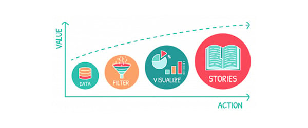
Tell a story with your data to inspire insights and drive change
3. Design your dashboard logically
“You can achieve simplicity in the design of effective charts, graphs and tables by remembering three fundamental principles: restrain, reduce, emphasize.” - Garr Reynolds
The look and feel of a dashboard is vital. The average human attention span is said to be around 8 seconds. So, place the most important information (metrics and dimensions) where it will be seen at first glance for the designated audience. Information naturally should flow vertically. So, design your dashboard from generic to specific when we move from top-to-bottom. The further down the page you scroll, the more granular your information should be.
Also, focus can be lost as a reader scans from left to right of page. So, thinking back to telling the story, place information logically from left to right so that it reflects that narrative e.g. orders > revenue.
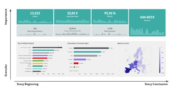
Design your dashboard logically from generic to more specific
To this end there are a number of different design principles you can consider. Here a few we think are important:
- Design a layout that emphasizes audience priorities and goals
- Exercise restraint with data. Don’t overload charts
- Make sure information flows logically between sections and pages
- Use signposts (breaks and titles) to distinguish between sections
Above all, think about your audience and test your designs. Ask people how well they work, what story they tell, and use that feedback to improve the design.
4. Use your visuals wisely
Once you have determined the overall design of your dashboard, it’s time to start thinking about the particulars. You’ll have a good idea of this already having got to this point but it’s still wise to assess your choice of graphs and other visuals to make sure they are the best choice.
You may have heard before that graphs should have a low-medium cognitive workload. All this means is that the audience should be able to easily understand the message. This can be achieved by adding no more than 3 to 4 metrics per graph and by inserting only necessary metrics with clear relationships to each other. If you do want to go off-piste and start combining more eclectic data sets, that’s ok, but remember your narrative - use text boxes to explain how these different data sets fit together and it all means.
As a rule of thumb, any chart should be easily understandable at first glance. If this doesn't happen, try to simplify. For the most part, using tried and tested chart formats will often be the best approach as they are familiar to people.
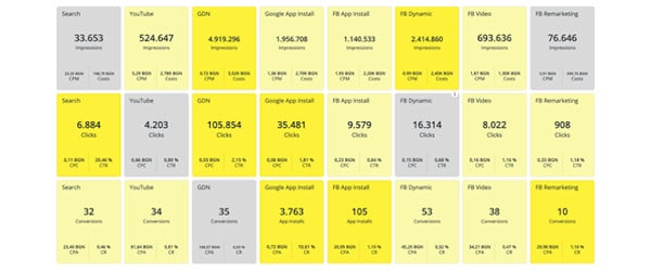
Again, go off-piste if you want, but don’t overload your dashboard with too many exotic graph types. Things like heatmaps, sunbursts, and complicated combination charts are fantastic - but use them sparingly. Remember your audience and keep them grounded with charts and visuals they will already be familiar with and intuitively understand. This way, your more impressive visuals will also stand out more and have greater impact instead of getting lost in a sea of overly complicated charts.
Similarly, don’t overload your dashboards with all the same graphs types - otherwise again, your narrative will be lost. Use different graph types to try and break up the information and make it easier for your audience to compartmentalize different metrics and digest the story you are trying to tell.
Don't do this! Use a mix of different visuals instead.
Concluding thoughts
Dashboards are an incredibly useful tool if designed correctly with an aim in mind. If not, they will simply end up gathering dust somewhere and never being used. Following these golden rules will help you in providing a tool that is both practical and inspires insights from its users. That said, there are two considerations worth pointing out.
First, over time, any dashboard will lose its usefulness. When this happens, don’t be afraid - it’s normal. This is because a good dashboard should tell a story, and that story is going to change over time as your company evolves and grows. What this means is that dashboards should be reviewed and updated regularly so they remain fresh and useful.
The second thing is that the role of the dashboard should not be misunderstood. While a good dashboard that follows the above golden rules will be a useful tool for inspiring new insights and actions - it cannot do that all by itself. Dashboards are not a magical quick fix that alone will revolutionize your business.
To get the most from them, businesses need to be structured so that they are able to act upon insights. Good dashboards need to be coupled with a data-literate culture and suitable buy-in from across the business. Companies seeking creative insights also need to consider how they can move beyond the dashboard by utilizing AI-powered and predictive analytics.
Want to get more out of your data?
Speak with one of our consultants to find out how Adverity can help you turn your data into insights that drive your marketing performance.


